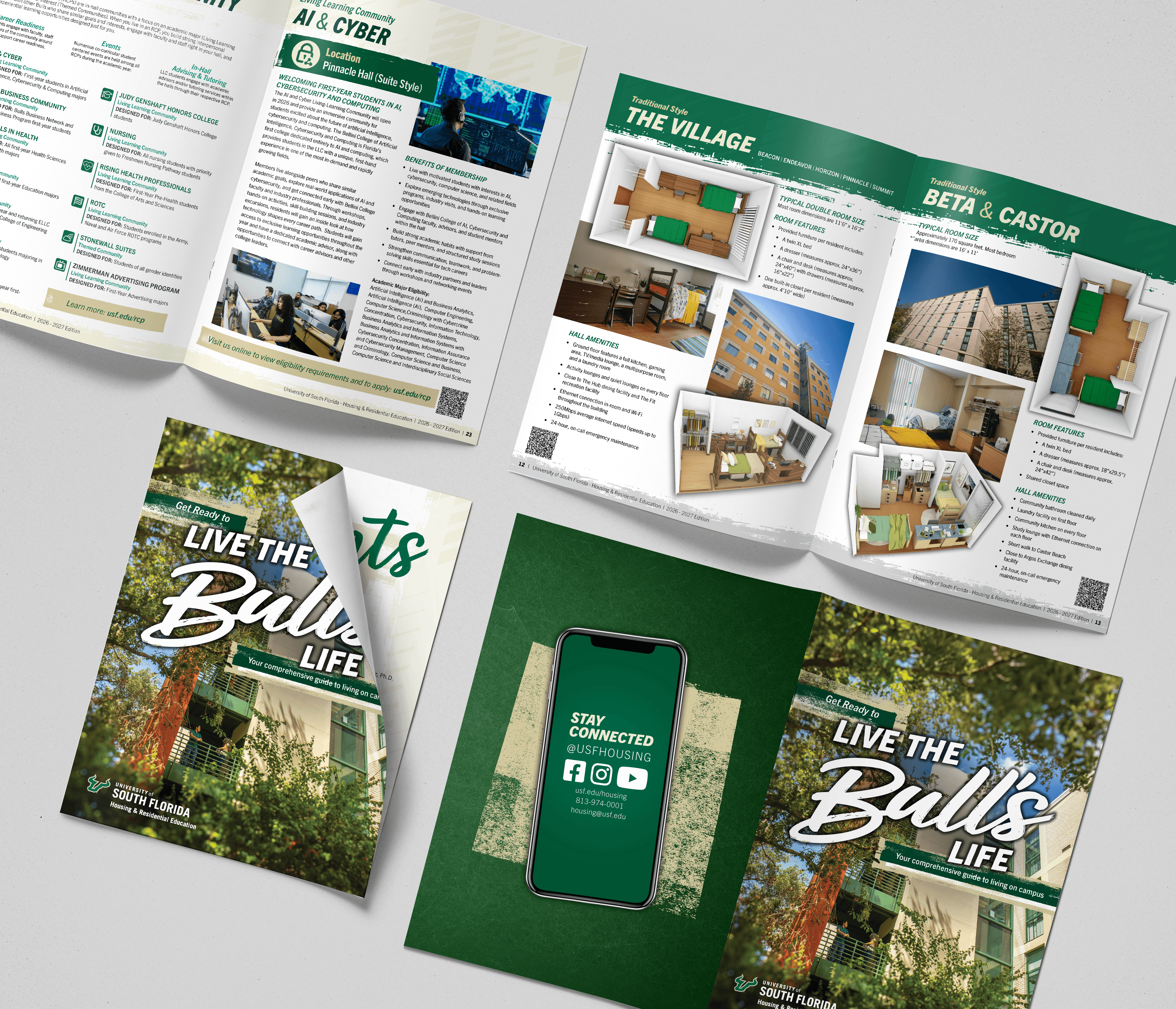
USF Housing Mailer Campaign
Grounded in aesthetic research and behavioral insight, this USF Housing Magazine Mailer Campaign positions on campus living as the most direct next step for admitted students. The work prioritizes clarity and strategic intent, supporting occupancy targets and protecting residential revenue. This mailer campaign translates that strategy into something tangible. From concept through production, each element is structured to drive action and measurable engagement.

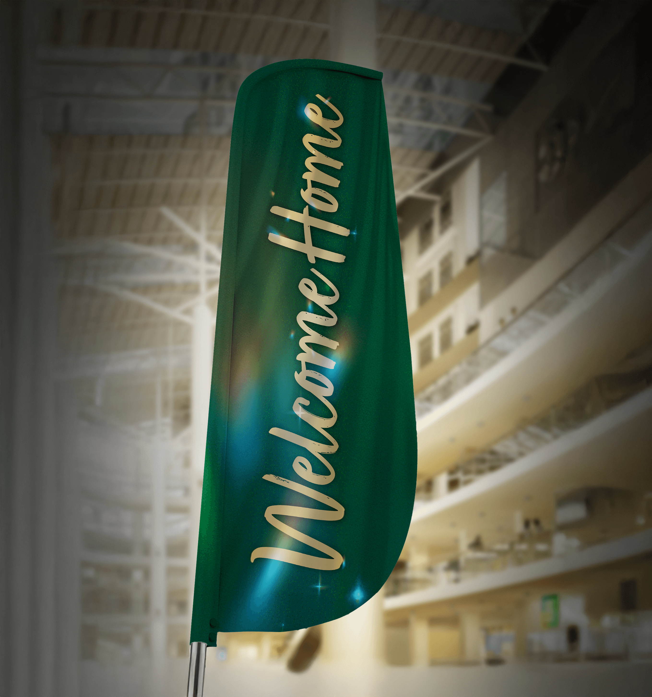
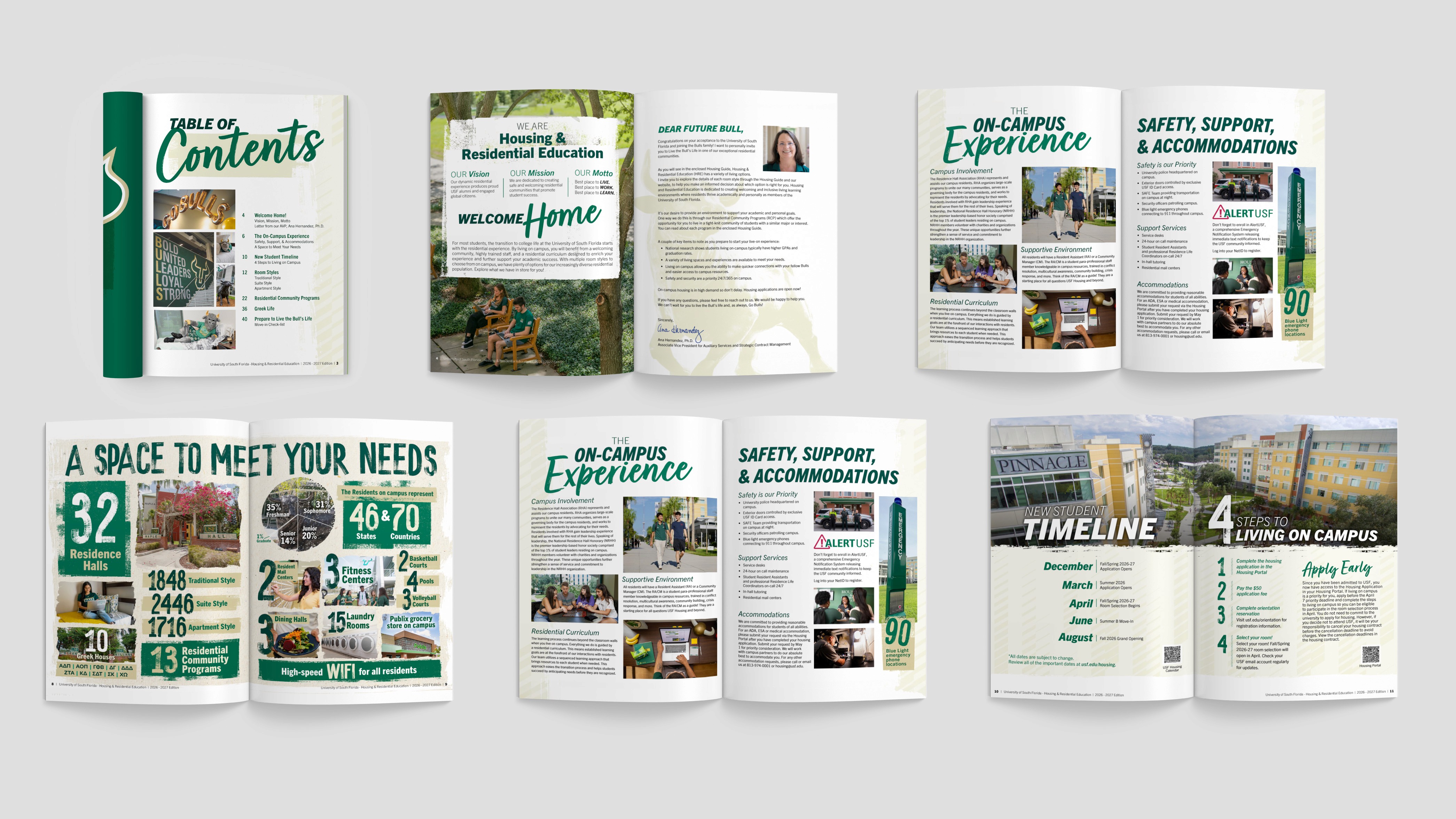
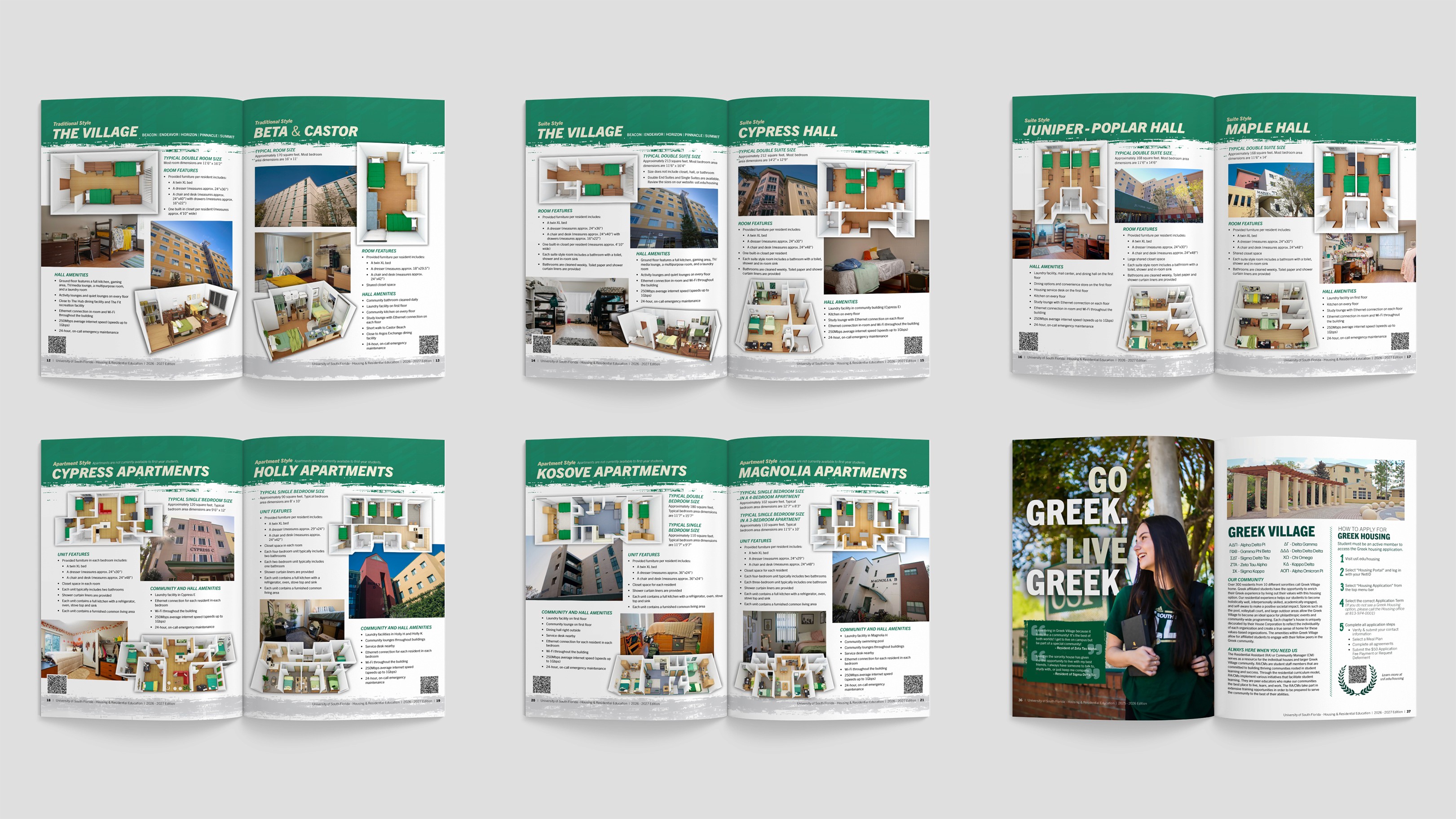
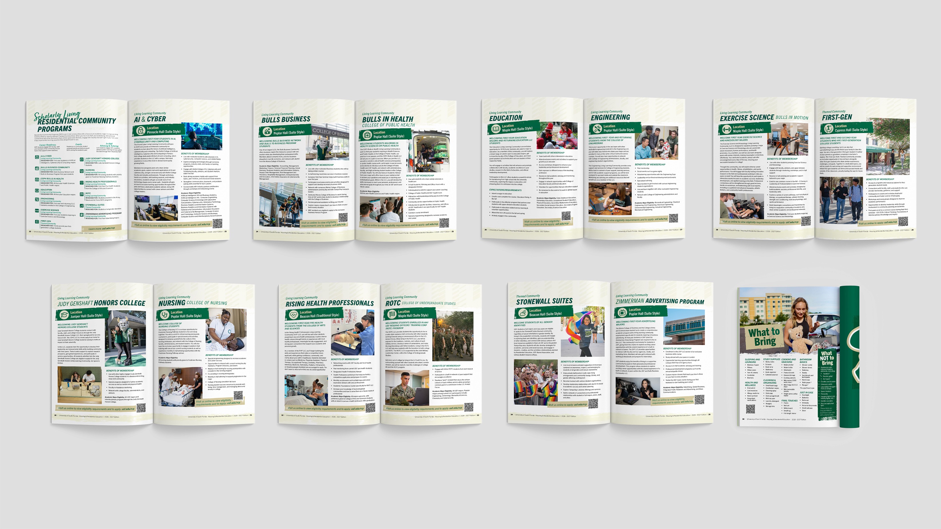
Live the Bull's Life
To "Live the Bull’s Life” is to live on campus. It frames campus housing as the full student experience and supports our mission to position it as the default choice for admitted students. The campaign extends beyond messaging, equipping students with tangible pieces that let them carry and express that identity themselves.
Aesthetic Research
This campaign was mailed domestically in the US to high school juniors and seniors who were admitted to the University. These prospective students are typically between the ages of 16 and 18, requiring a visual approach that aligns with their expectations while remaining consistent with USF’s institutional brand.
My research began by reviewing current design trends across social media, Pinterest, blogs, higher education marketing, and youth-focused brands. This generation is exposed to a wide range of visual aesthetics. The challenge was identifying trends that would feel contemporary and engaging while still supporting USF’s brand standards.
Narrowing it down, these were the observations that informed my approach:
Bold Minimalism - Many contemporary designers value minimalism with white space, restraint, with bold and obvious hierarchy so the object carries the meaning.
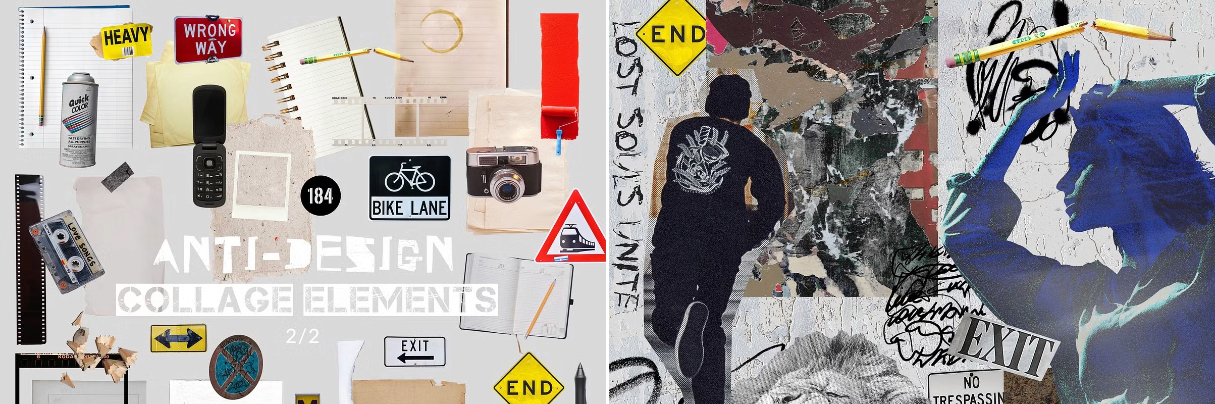
Anti-Design - Many younger audiences respond to work that feels authentic rather than overly polished. Rough textures, collage-inspired compositions, and imperfect alignment introduce a visible human touch and create a sense of personality.

The Merger - Minimalism and Anti-design are not contradictions. Minimalism is about a reduction of cognitive load. Anti-Design is about rejection of professional performativity. Together, they create a visual language that feels both clear and human. USF’s Athletics department leans into the anti-design trend.
USF Athletics follows this anti-design trend while adhering to USF’s brand standards. I kept this in the back of my mind while designing. However, I choose to lean more deeper into the institutional formality compared to Athletics. With my visual aesthetic decided, here are some sample pages of what I came up with.:
“Highly refined visual presentations were perceived as less trustworthy by younger audiences, who associated excessive polish with persuasive intent rather than informational intent.” (SUIC 2020 Proceedings)
Paper textures are leading this movement — one of the most searched ‘graphics’ terms on Envato, with over 3.6K searches in the past two months, and 67% of those resulting in downloads. Designers are clearly seeking ways to bring natural tactility and human warmth into their digital work. (Graphic Design Junction)
Participants showed higher trust when the structure of the message was immediately visible and easy to pars. (Fogarty, Rewired)
Purchasing & Procurement6
USF has awarded contracts for Marketing and Promotional items under 2023-070-ITN-PRO. When purchasing from one of these contracted vendors, no bid process is needed.
I recognize that choosing an existing awarded supplier would have saved effort on my end. However, awarded suppliers are often substantially more expensive. By investing extra due diligence, I negotiated a cost reduction by approximately $18,000 (a little of 30% cost difference in bids).
Winning Vendor: $38,532
USF’s Awarded Suppliers: $56,787.52
Savings: $18,255.52
The Impact
This mailer campaign reached over 30,000 admitted students. Measuring this engagement was through observing QR code scans to our website.
QR code scans:
462 sessions
48.3% response rate
Engagement Quality:
~48.9s average engagement time
4,902 total events
10.6 events per visitor
Interpretation:
Recipients who scanned these QR codes averaged just over 10 interactions per visitor. These users who scanned were actively perusing housing options, not passively browsing. This engagement behavior aligns with the mailer acting as a consideration and decision-reinforcement touchpoint as intended.
Page Disclaimer: All trademarks, brand names, and logos shown herein are the property of the University of South Florida and protected by law. The University of South Florida does not sponsor, endorse, or affiliate with any of the products or services offered through this site.